Sentiment Visualization Total: 1,998 Comment
Chart Interpretation
The chart displays the distribution of public opinion on government budget efficiency policies.
- Green ➔ positive opinion, indicating support or appreciation.
- Red ➔ negative opinion, indicating criticism or rejection.
- Yellow ➔ neutral opinion, tending to be impartial.
Through this visualization, we can quickly see the trend of public sentiment. If positive opinions are more dominant, it means the policy tends to be well-received. Conversely, if negative opinions are higher, there is a potential resistance that needs to be addressed.
Classification Evaluation Report (Naive Bayes)
| Sentiment | Precision | Recall | F1-Score | Support |
|---|---|---|---|---|
| Negative | 0.68 | 0.77 | 0.72 | 111 |
| Neutral | 0.82 | 0.83 | 0.83 | 230 |
| Positive | 0.83 | 0.57 | 0.67 | 60 |
| Weighted Avg | 0.78 | 0.78 | 0.78 | 401 |
Confusion Matrix
* Angka berlatar belakang warna tebal (diagonal) menunjukkan jumlah data yang berhasil diklasifikasikan dengan benar (True Positive / True Negative / True Neutral).
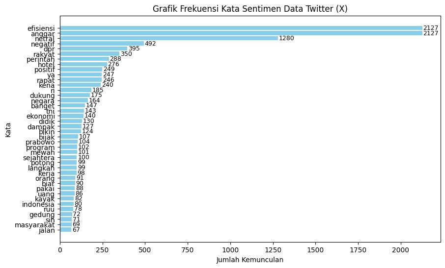
Grafik Frekuensi Kata Sentimen Data Twitter (X)
Visualisasi distribusi 40 kata kunci dengan frekuensi kemunculan tertinggi berdasarkan dataset opini hasil ekstraksi TF-IDF.